Greet someoneTry this phrase
Wah gwaan?
What's going on? / How are you?
A casual greeting for people you know. Tone makes it warm and easygoing.
Find the right Patois for the moment—with natural meaning and context.
Choose a situation
What's going on? / How are you?
A casual greeting for people you know. Tone makes it warm and easygoing.
Dictionary + translator
Search the spellings people actually use, or translate a complete thought with its meaning intact.
An exclamation of surprise, shock, disbelief, or admiration—strength depends on tone.
Browse full dictionary →Word for word: What you are do later?
Note: “A” marks the ongoing action.
Start with these
Learn the meaning, pronunciation, and context behind expressions you hear in conversation, music, and across the diaspora.
What is going on? / How are you?
Food & drinkTo eat or consume food.
Everyday talkI will be there later; timing is flexible.
DescriptionStrong, capable, or formidable despite size.
Good, peaceful, or in a positive state.
See examples and origin →Browse the language
Explore the words through the parts of Jamaican life that make them meaningful.
Why RebelOne Patois
Meaning lives in phrasing, tone, and situation. Every translation can teach you how the sentence is built.
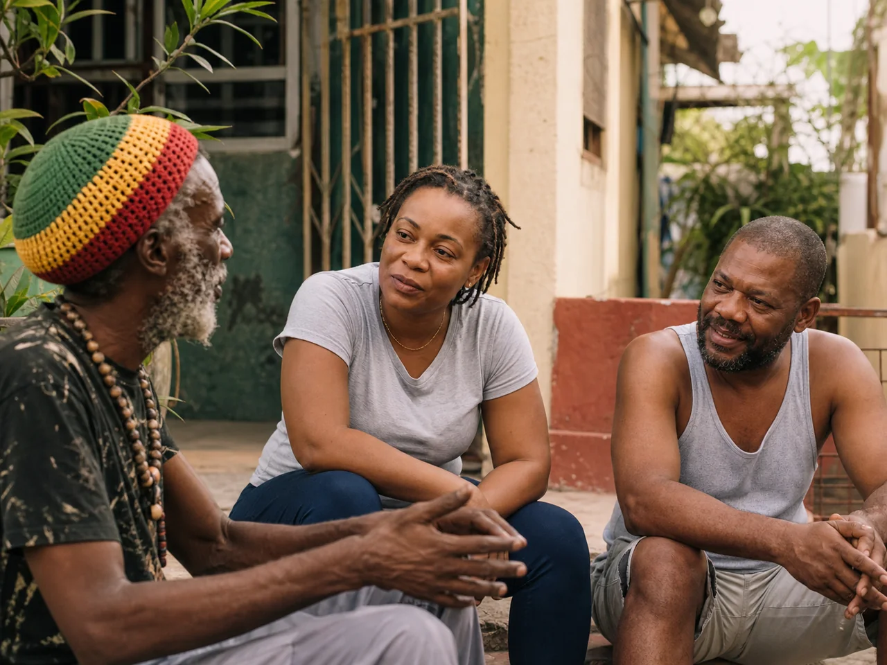
I’m here; everything is good.
The literal parts help learners see the grammar.
Often used when someone asks how you are doing.
Language lives here
Go deeper into the histories, sounds, meals, and sayings carried inside the language.
Trace the languages, migrations, and creativity that shaped everyday speech.
Read the story →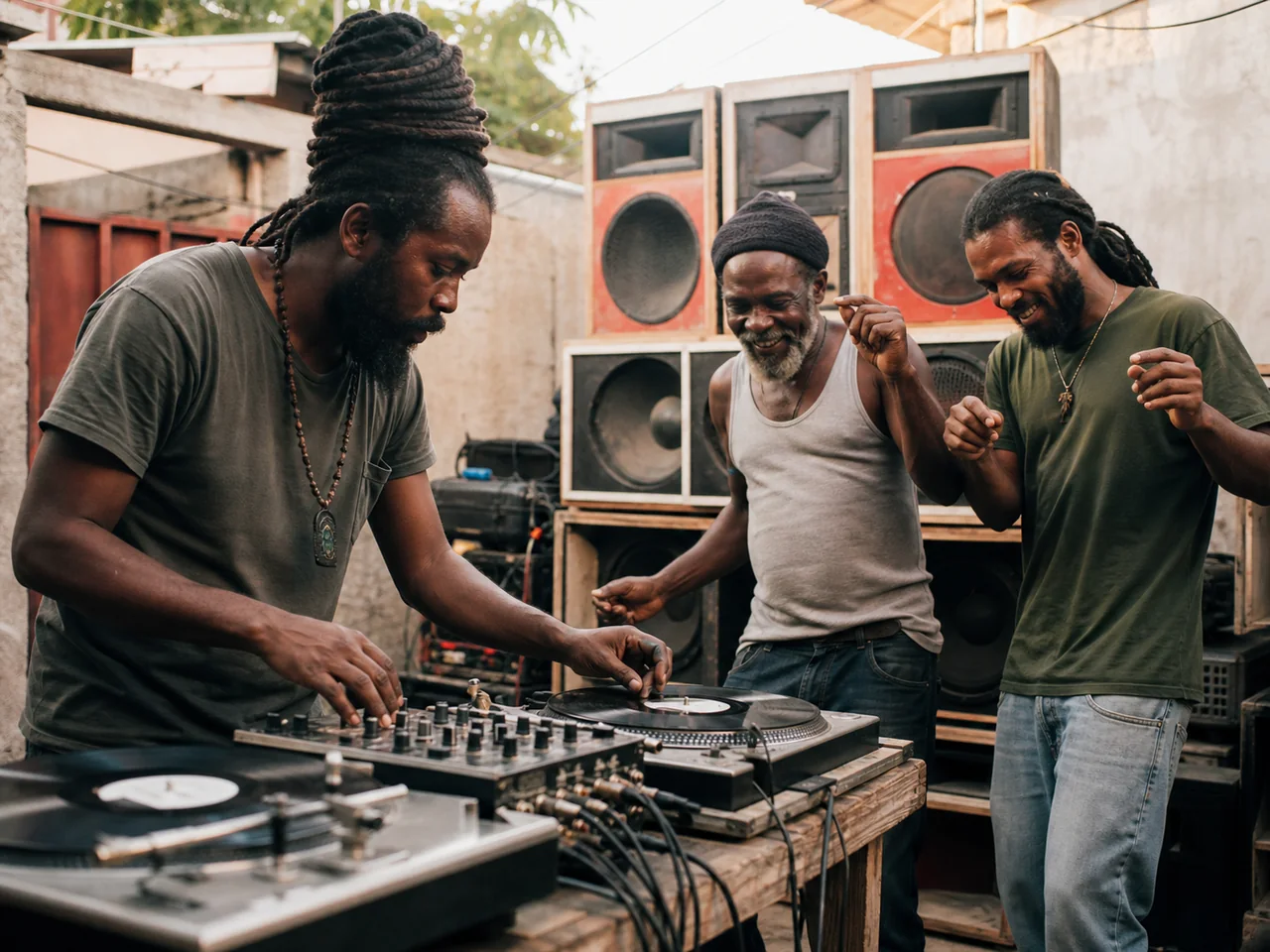 Music
MusicThe vocabulary behind the sound-system session.
Learn the language →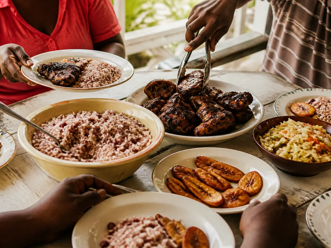 Food
FoodWhat Jamaican food words reveal about place and memory.
Open the guide →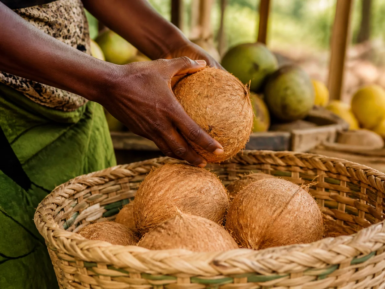 Proverbs
Small steps add up. See the wisdom inside the saying.
Explore proverbs →Phrasebook
Every phrase comes with its English meaning and a plain pronunciation guide.
Browse by category
Move through the dictionary by the situations, traditions, and communities that give each word its meaning.
From the language to the look
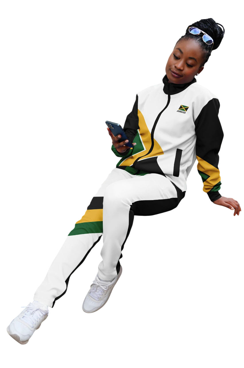
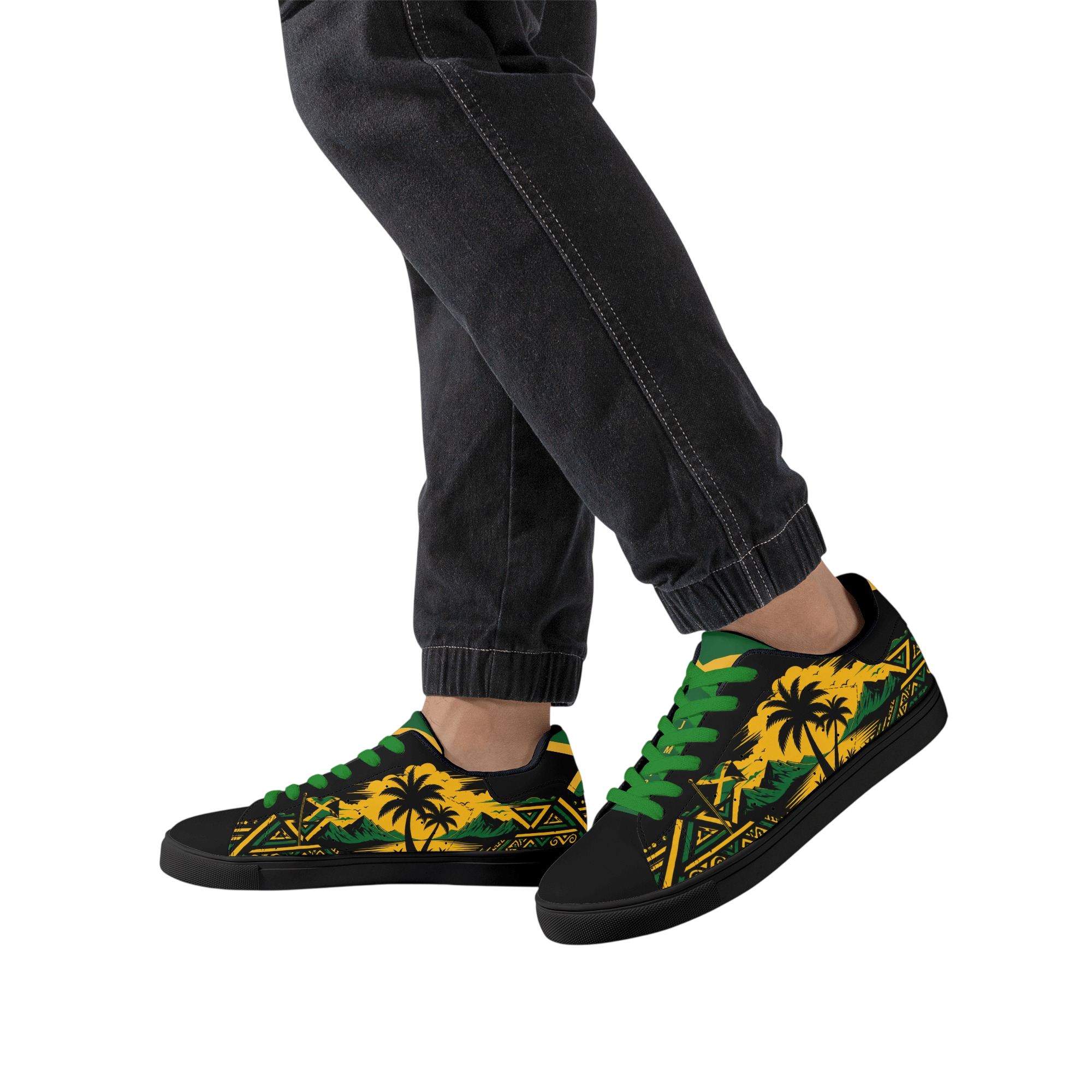
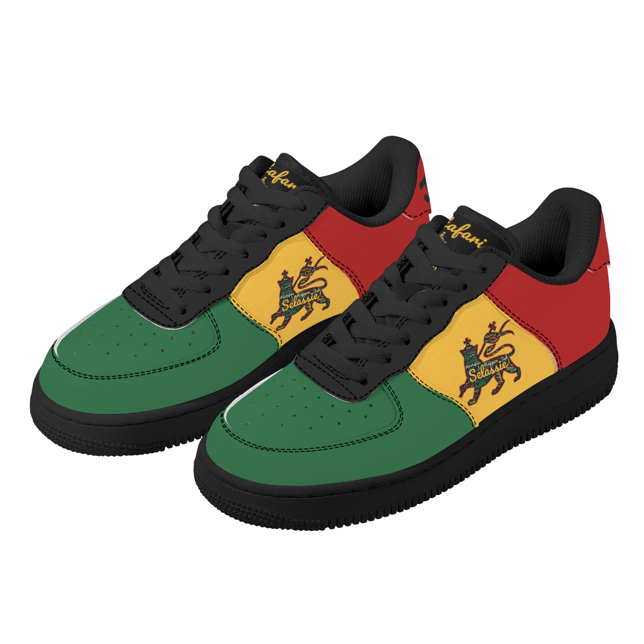
Keep learning here, then explore Jamaica-inspired pieces from RebelOneMart when something speaks to you.
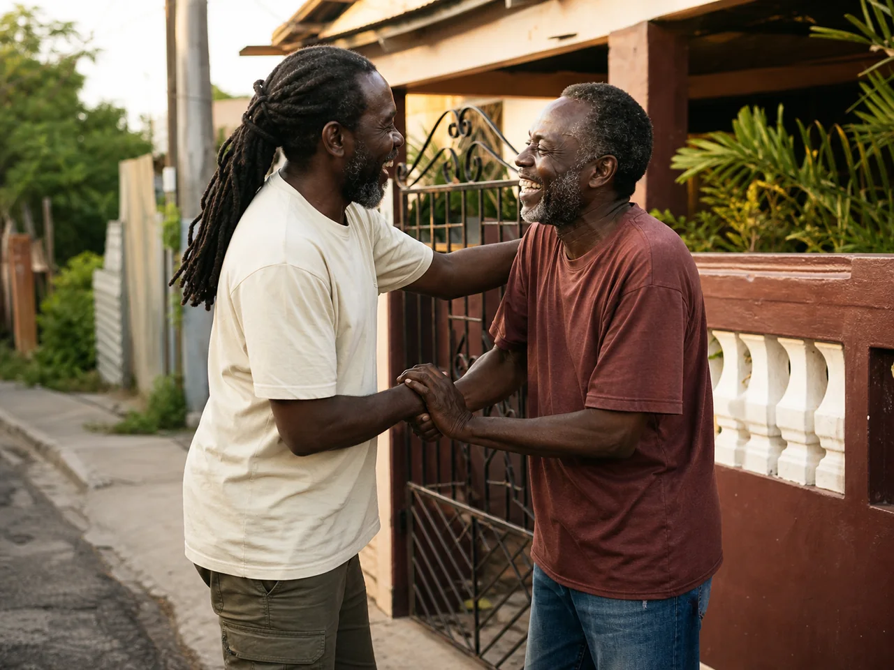 Explore 8 phrases →